
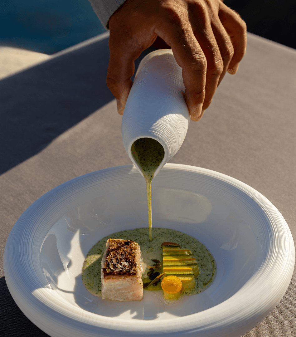
About
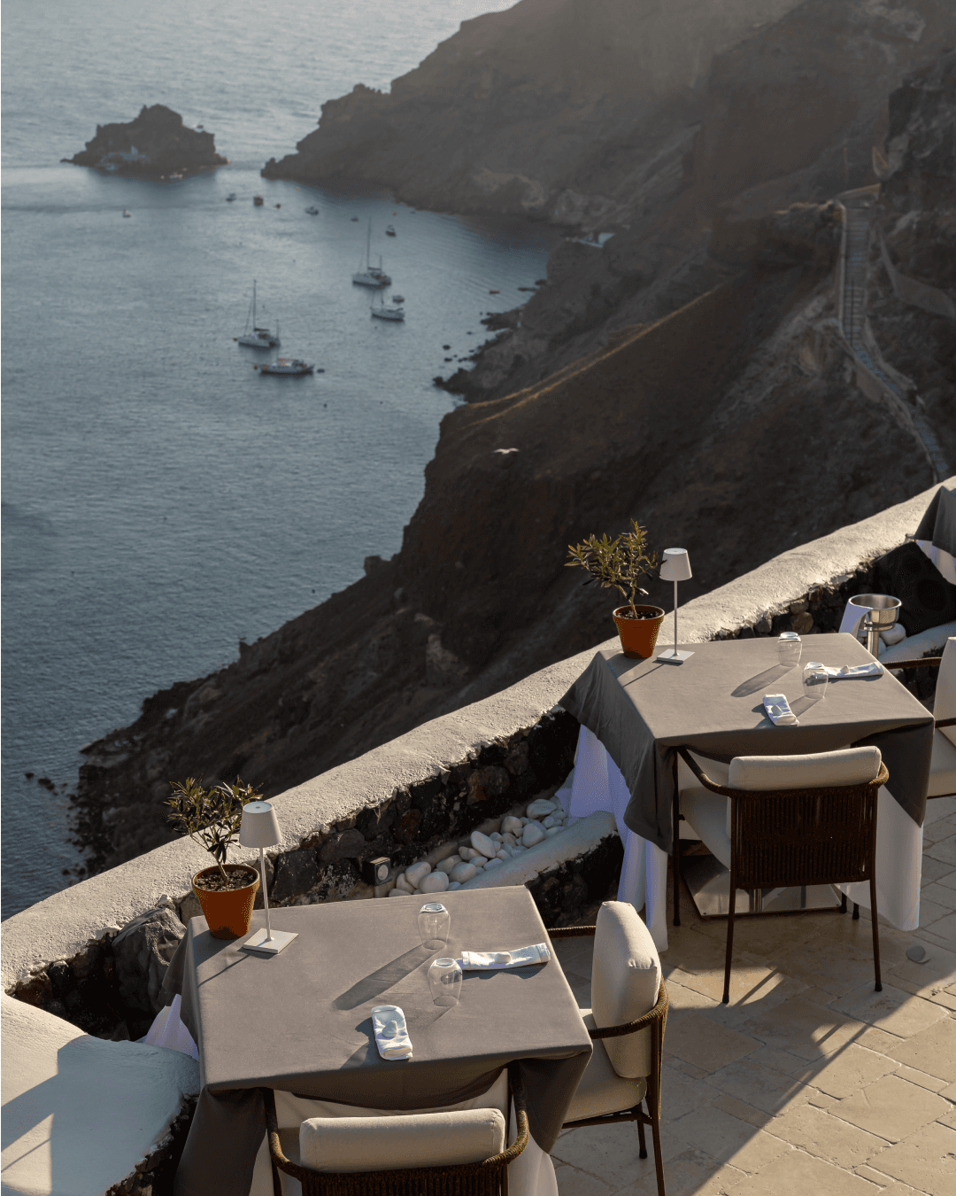
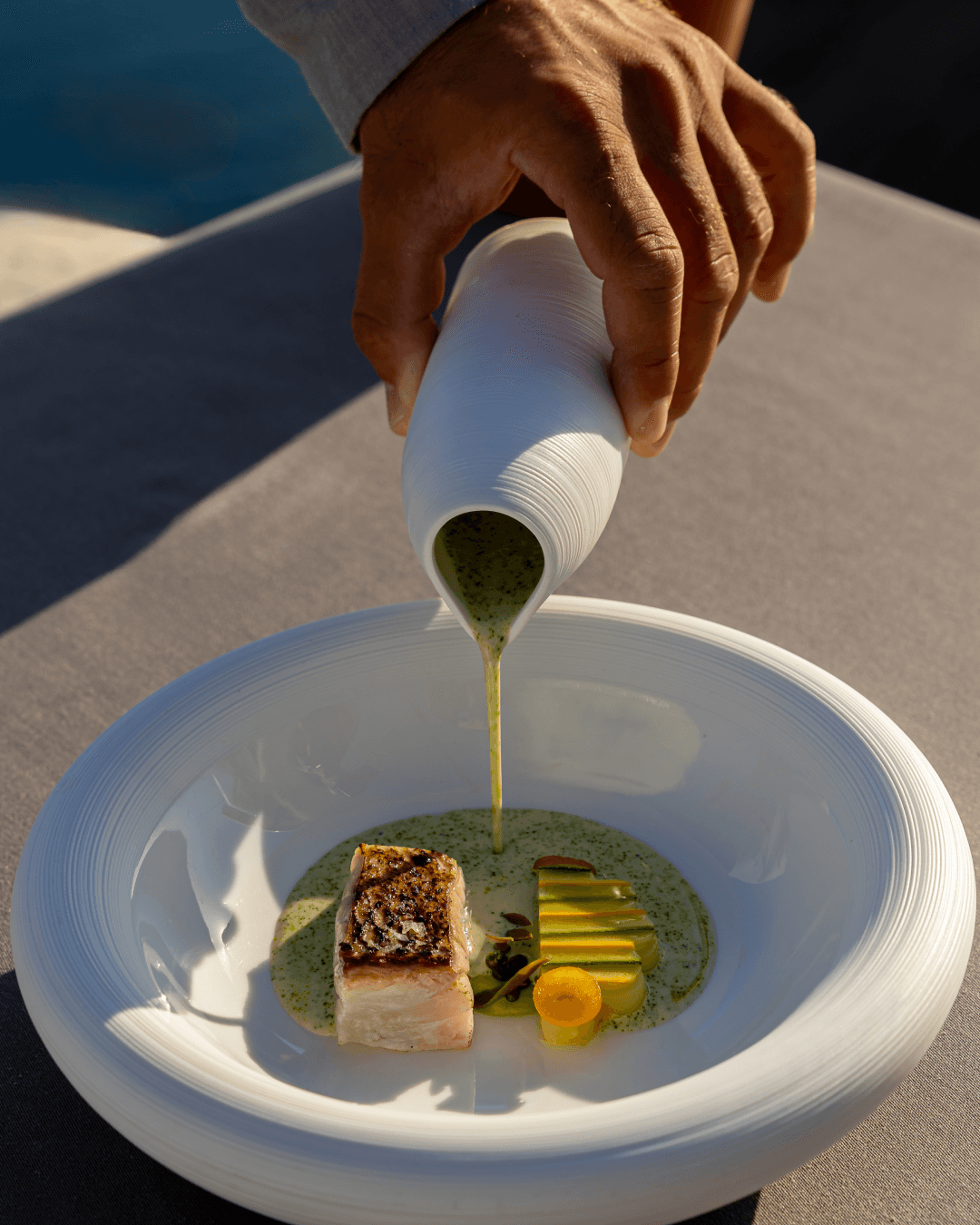
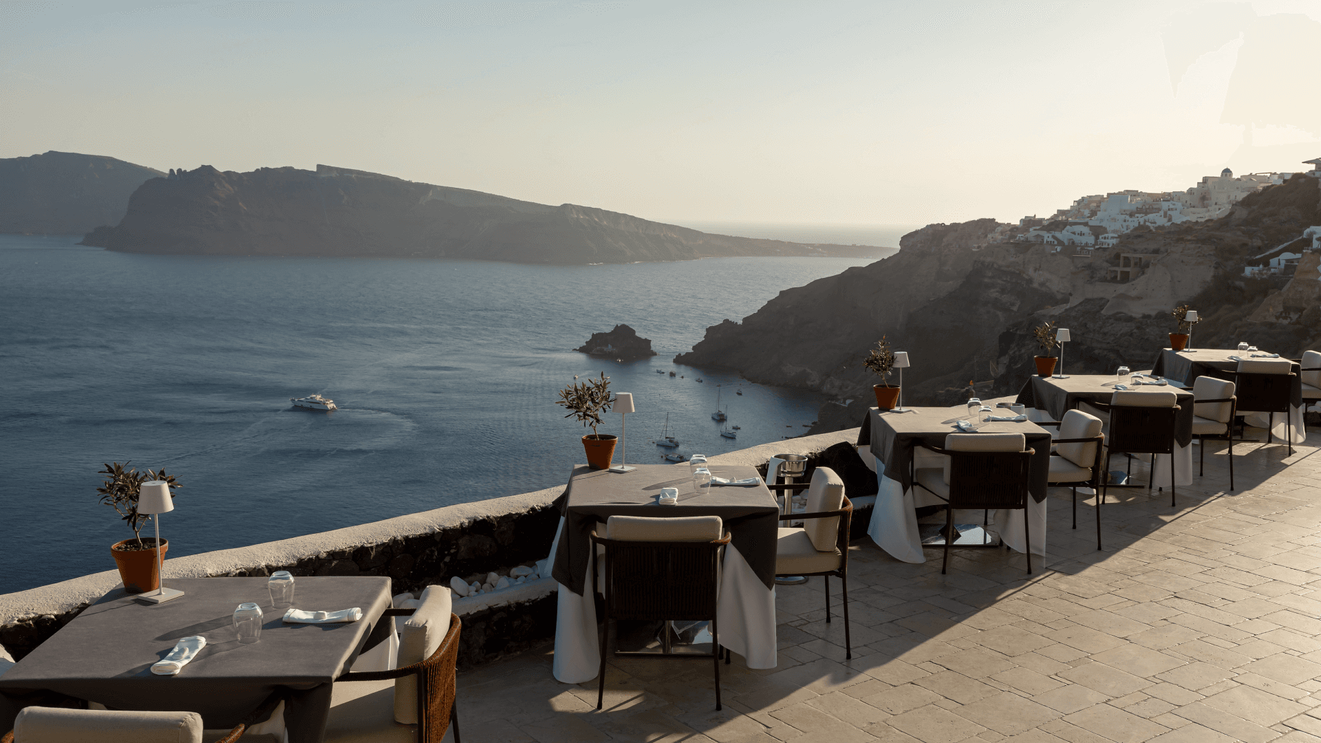
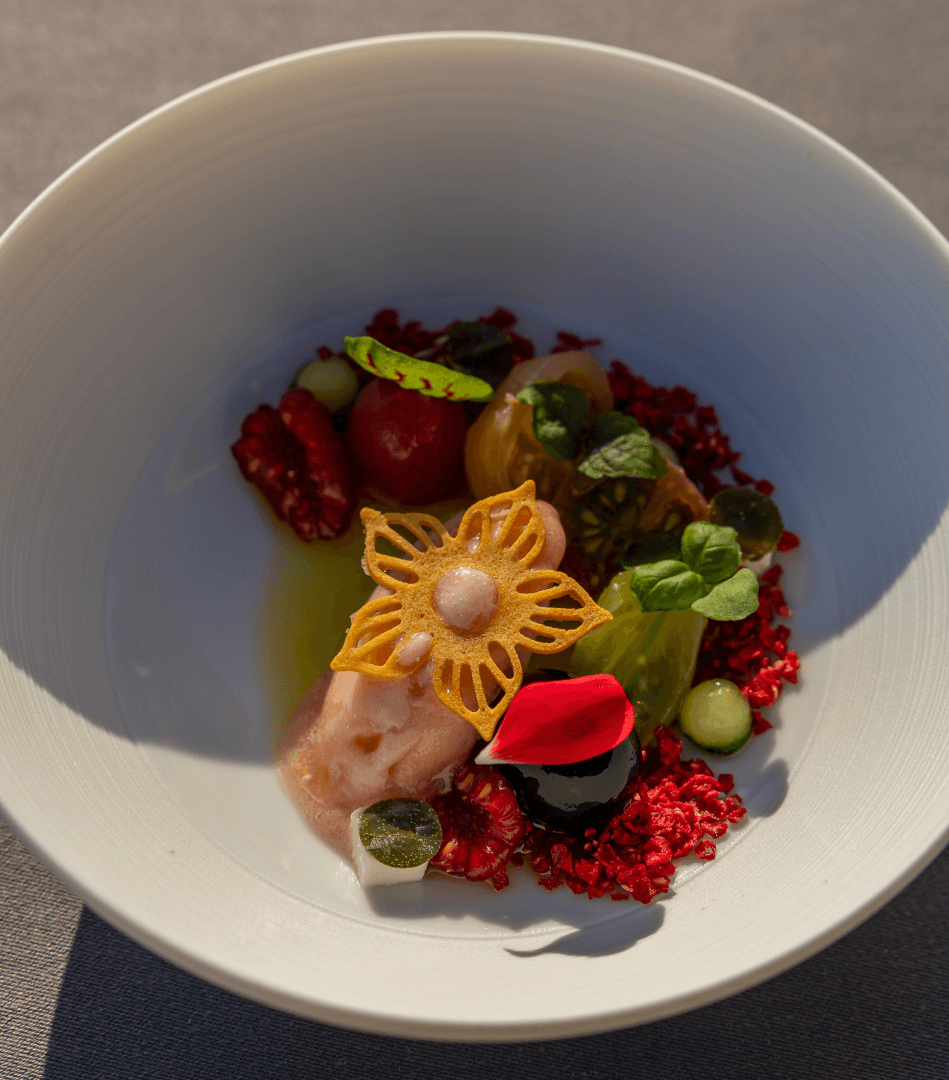
Petra sits on the edge of the caldera. Greek fine dining by chef Tasos Stefatos, served where the volcano meets the sea. The name means stone, and that single word became the whole system.
Brand identity and art direction for Petra, the cliffside fine-dining restaurant at Canaves Oia Suites, Santorini. The name means stone, so the whole system was built from the island's own material: an elegant serif that echoes cut rock, a fluid blue pattern pulled from the Aegean, and applications running from embossed volcanic-rock cards to a topographic laser-cut menu.
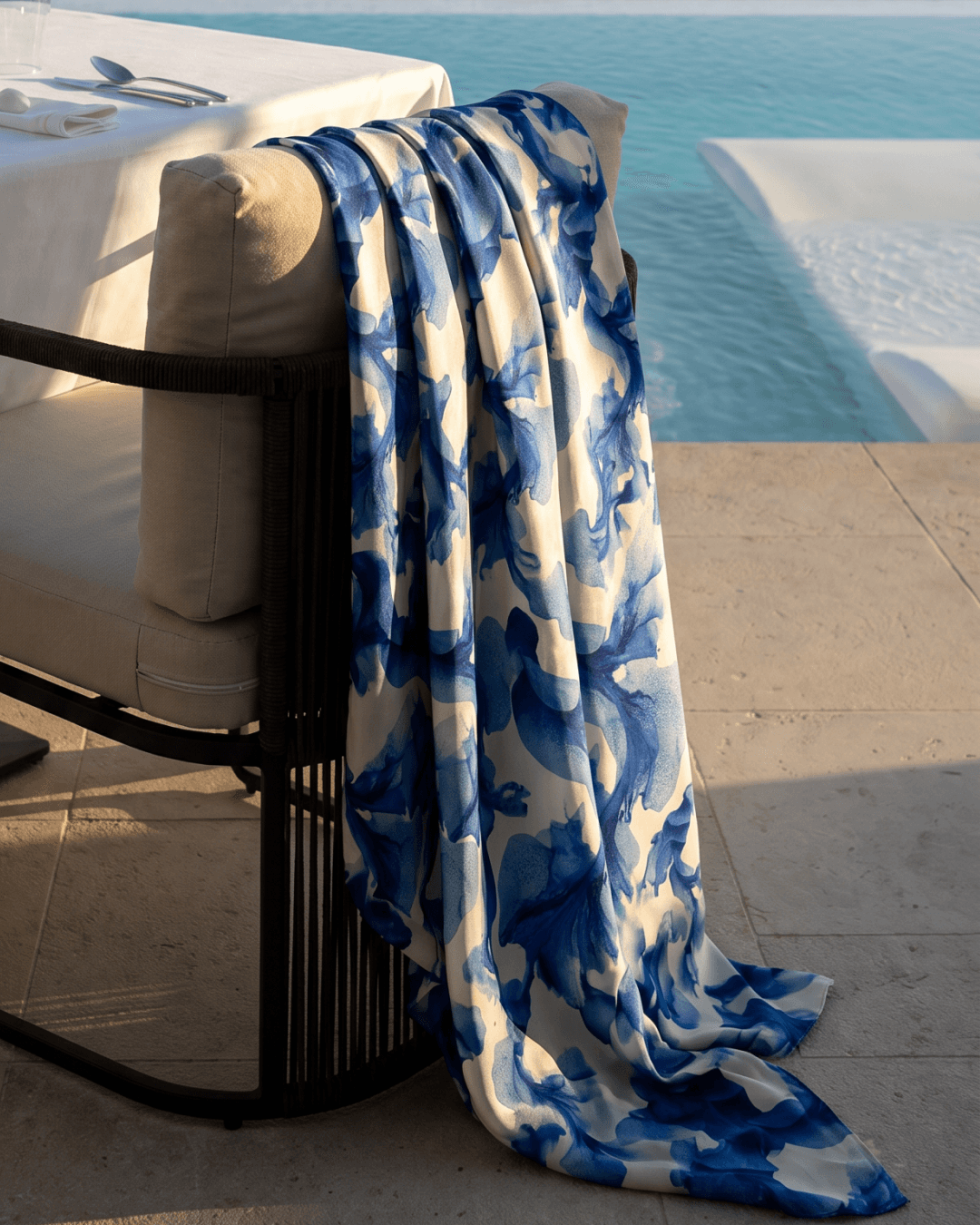
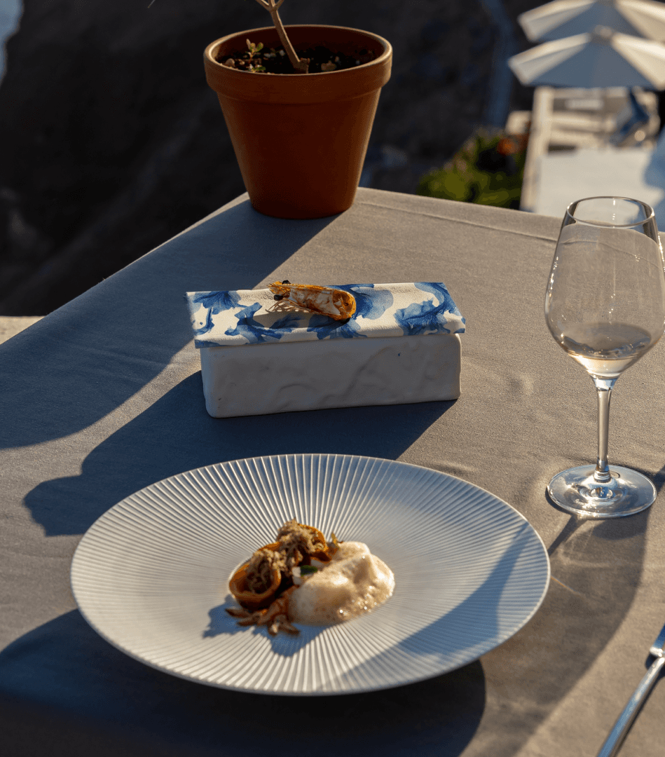
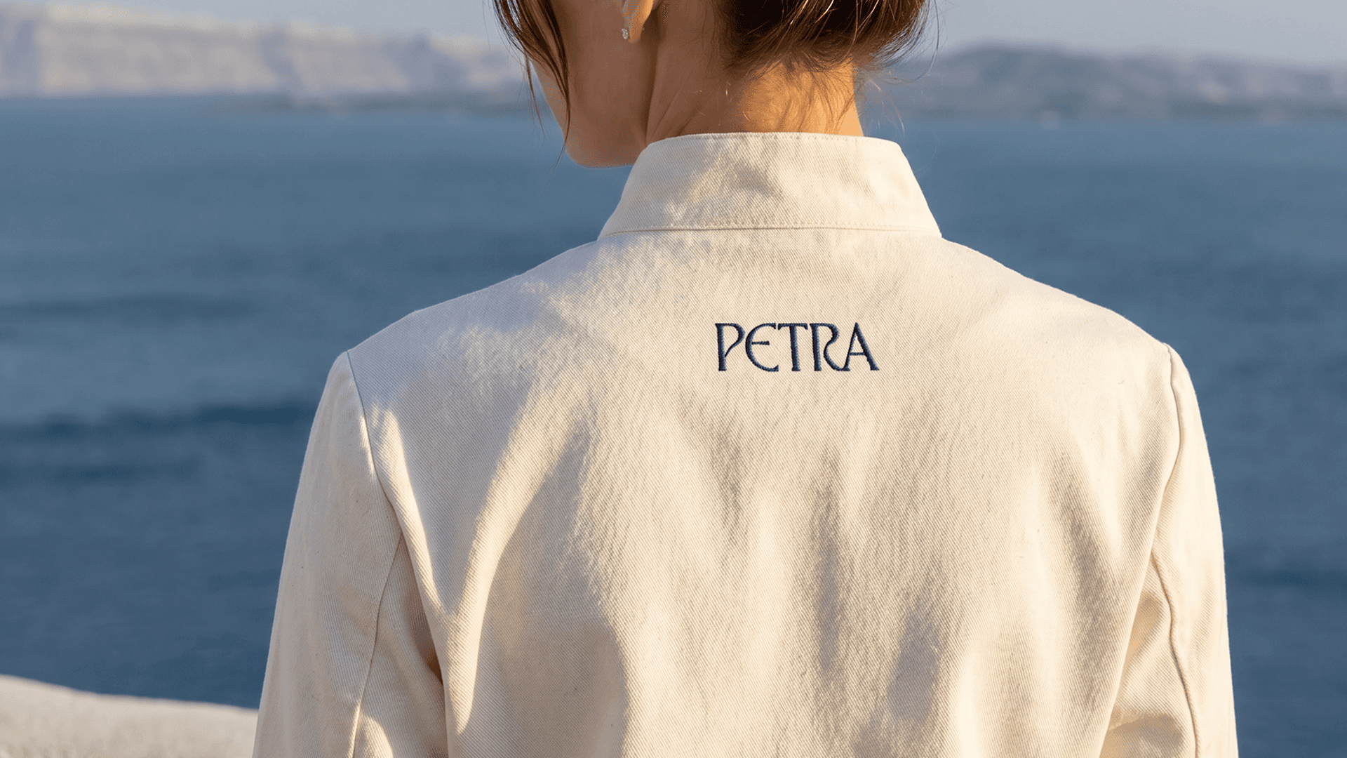
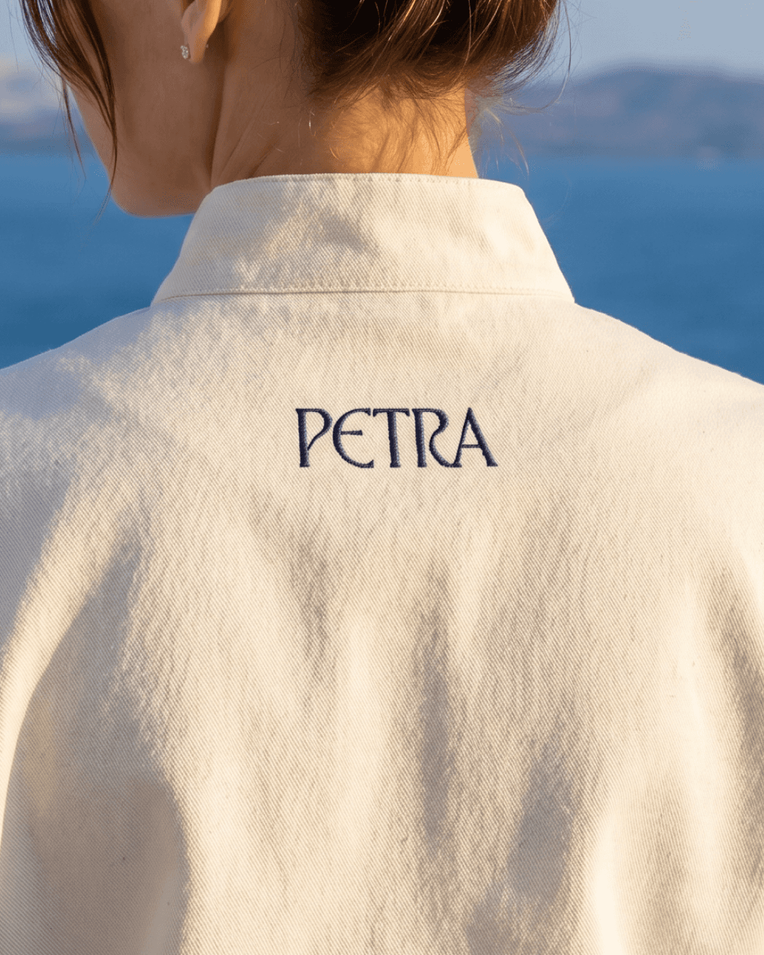
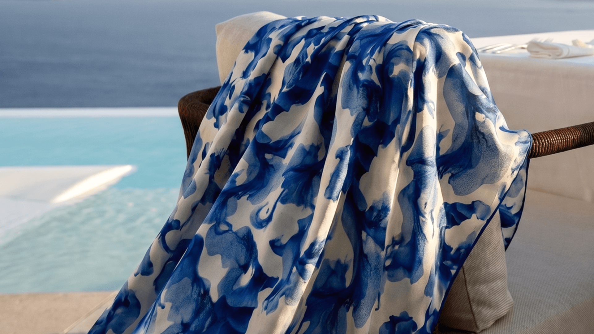
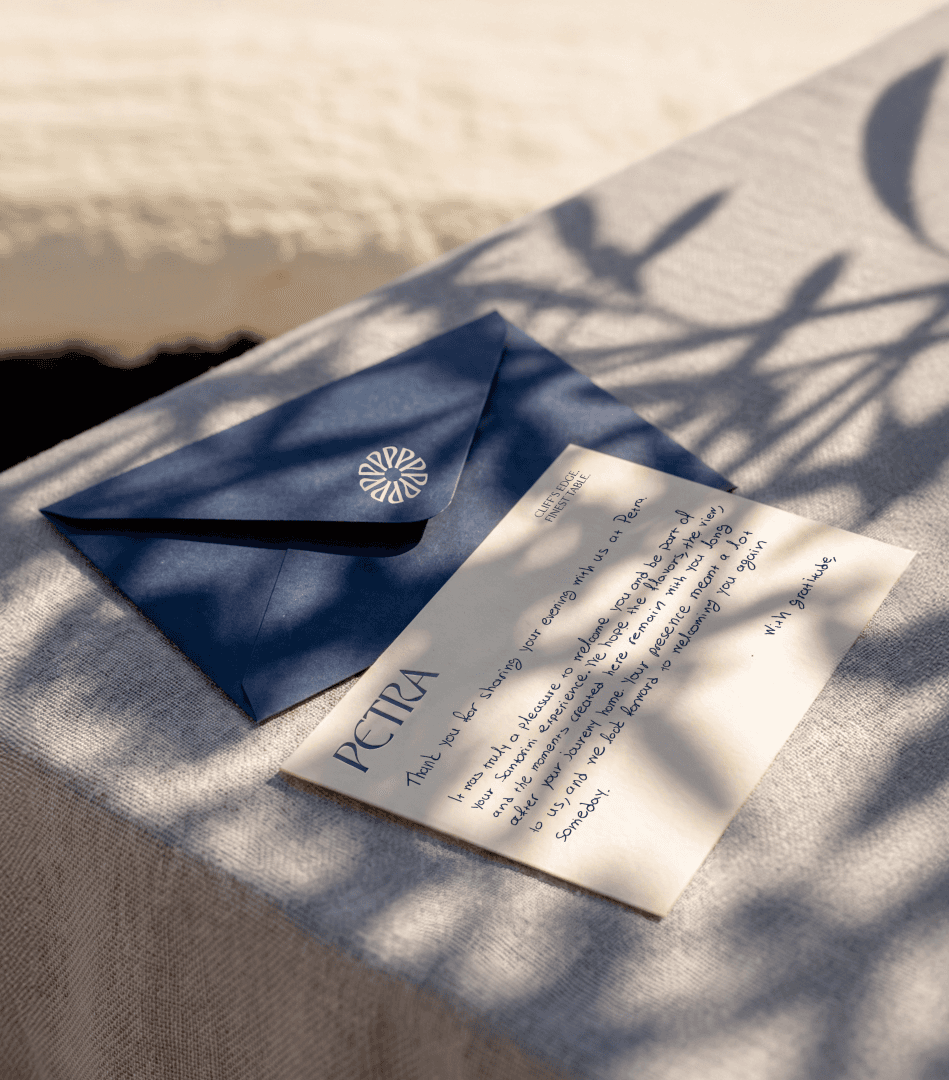
Around it lives a signature pattern, a fluid blue abstracted from the island's flora and the deep Aegean. It moves across the system at every scale: table linens and throws, the napkins, the packaging, the staff robes carried in quiet navy embroidery. A single rosette monogram seals the correspondence.
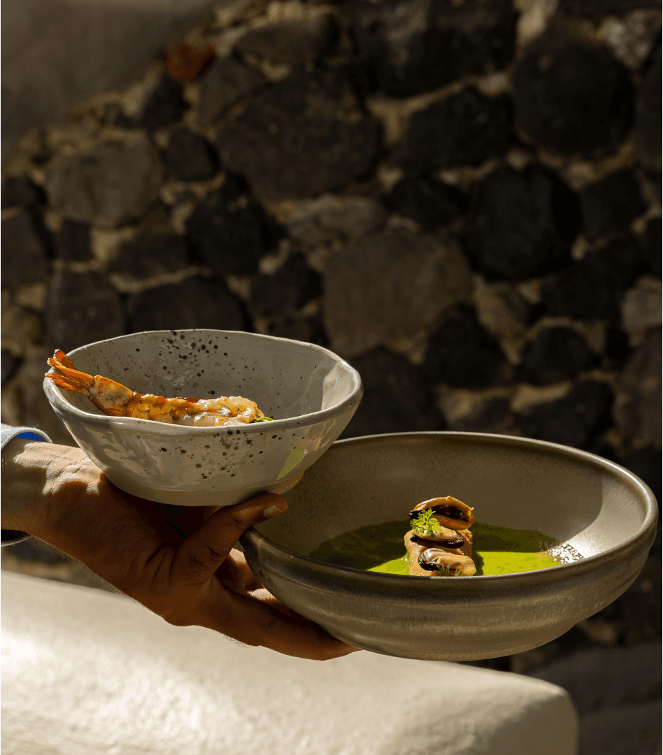
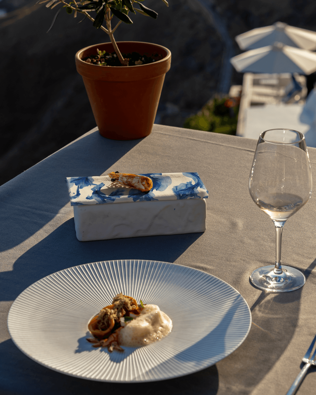
The palette holds two registers, the blue-and-white of the Cyclades and the warm grain of stone and sand, so the brand reads as luxurious without ever tipping into postcard.
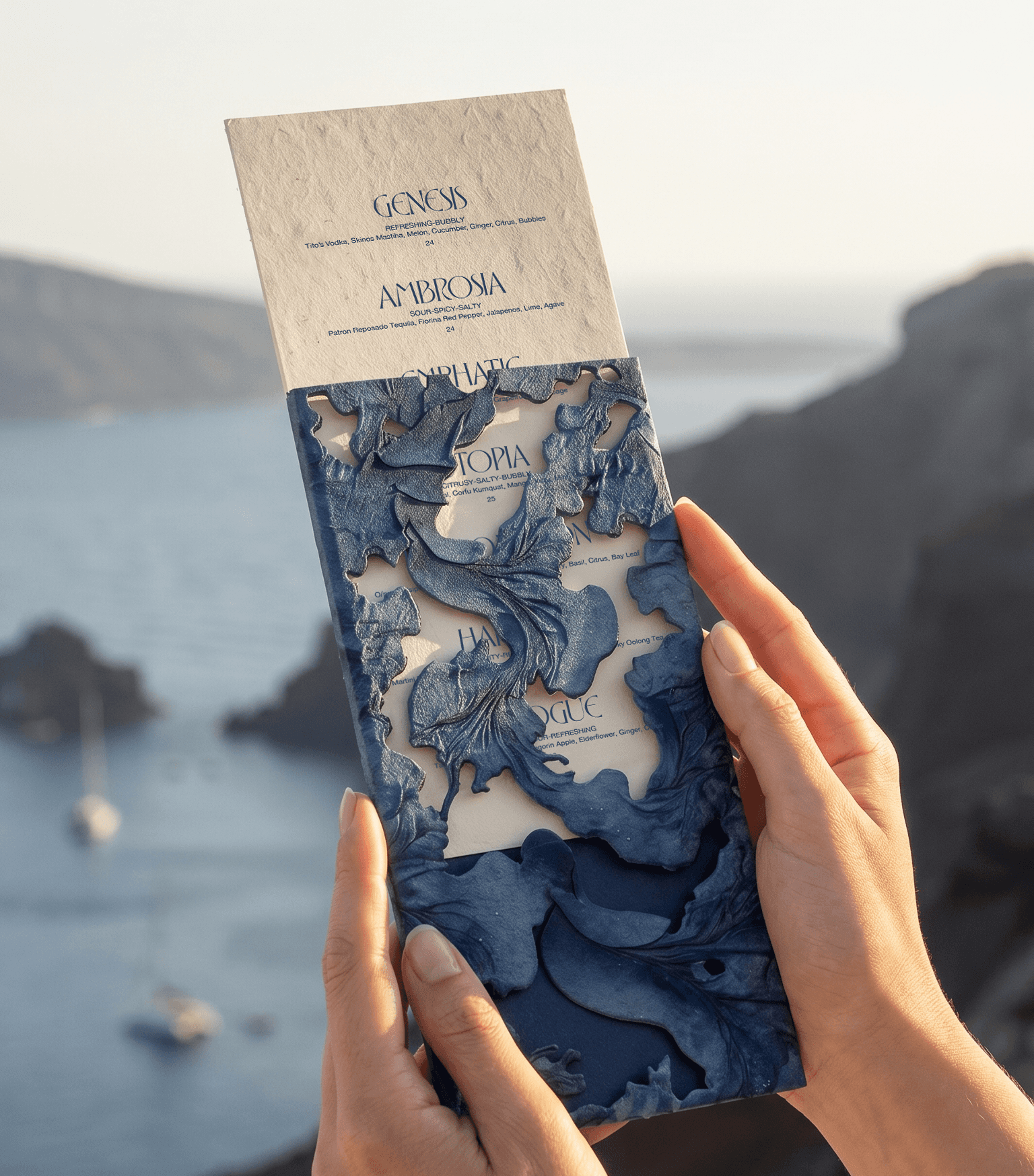
The full campaign was art-directed on site, in the last golden hour before service: the laser-cut, topographic menu echoing the strata of the caldera; the handwritten welcome card; the table set against the open sea. Every frame is part of the system, not a photograph of it.
Client
Petra Restaurant
Category
Branding, Art Direction
Year
2026


More projects


