About
Project Soma: Where Classic Meets Contemporary
A Bold Rebranding That Weaves Spontaneity, Style, and Story into Fashion Identity
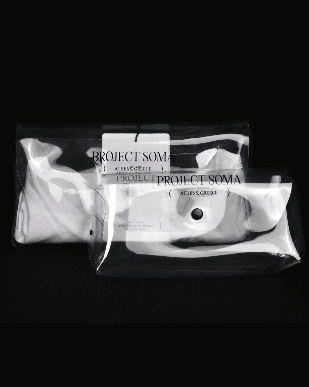
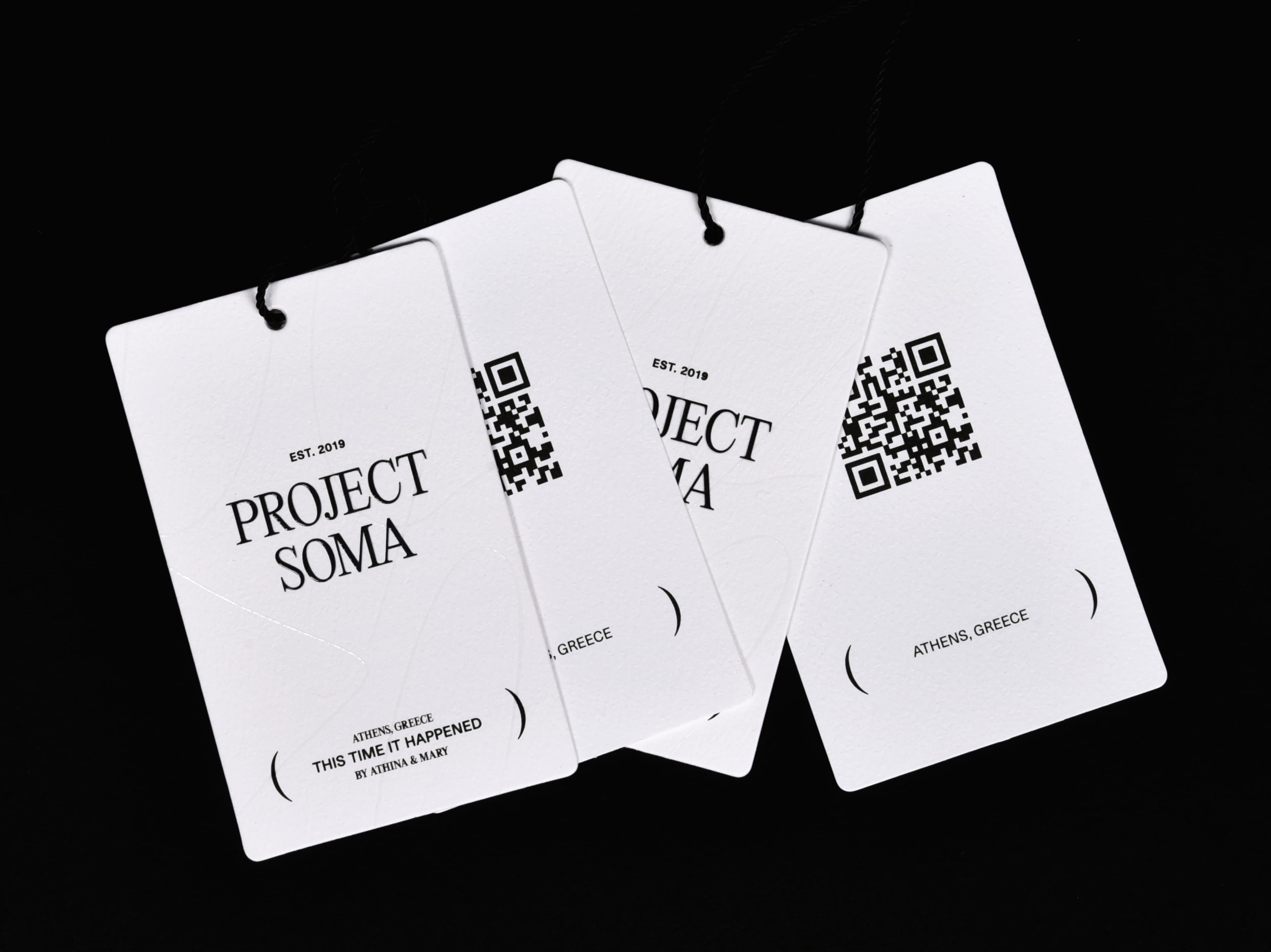
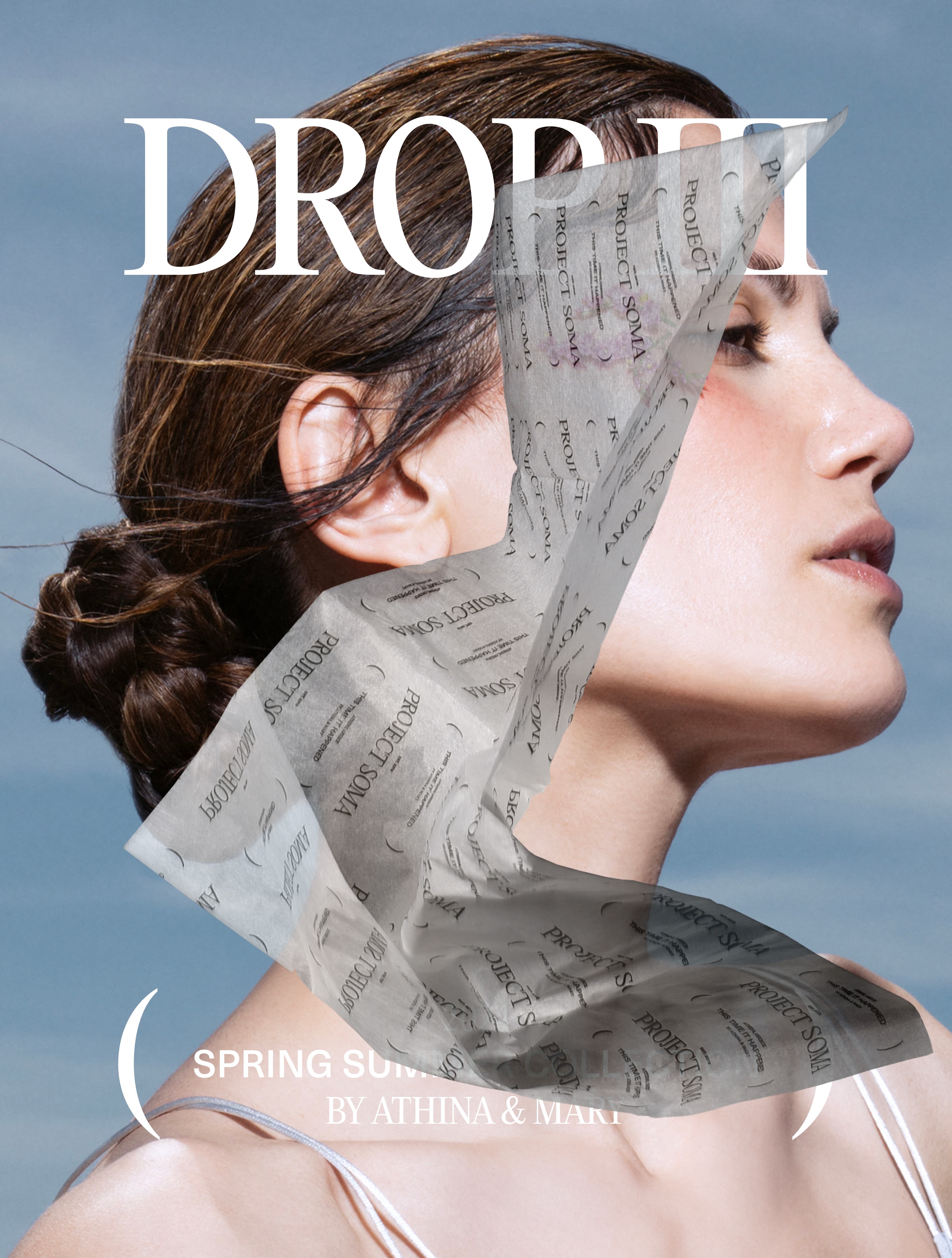
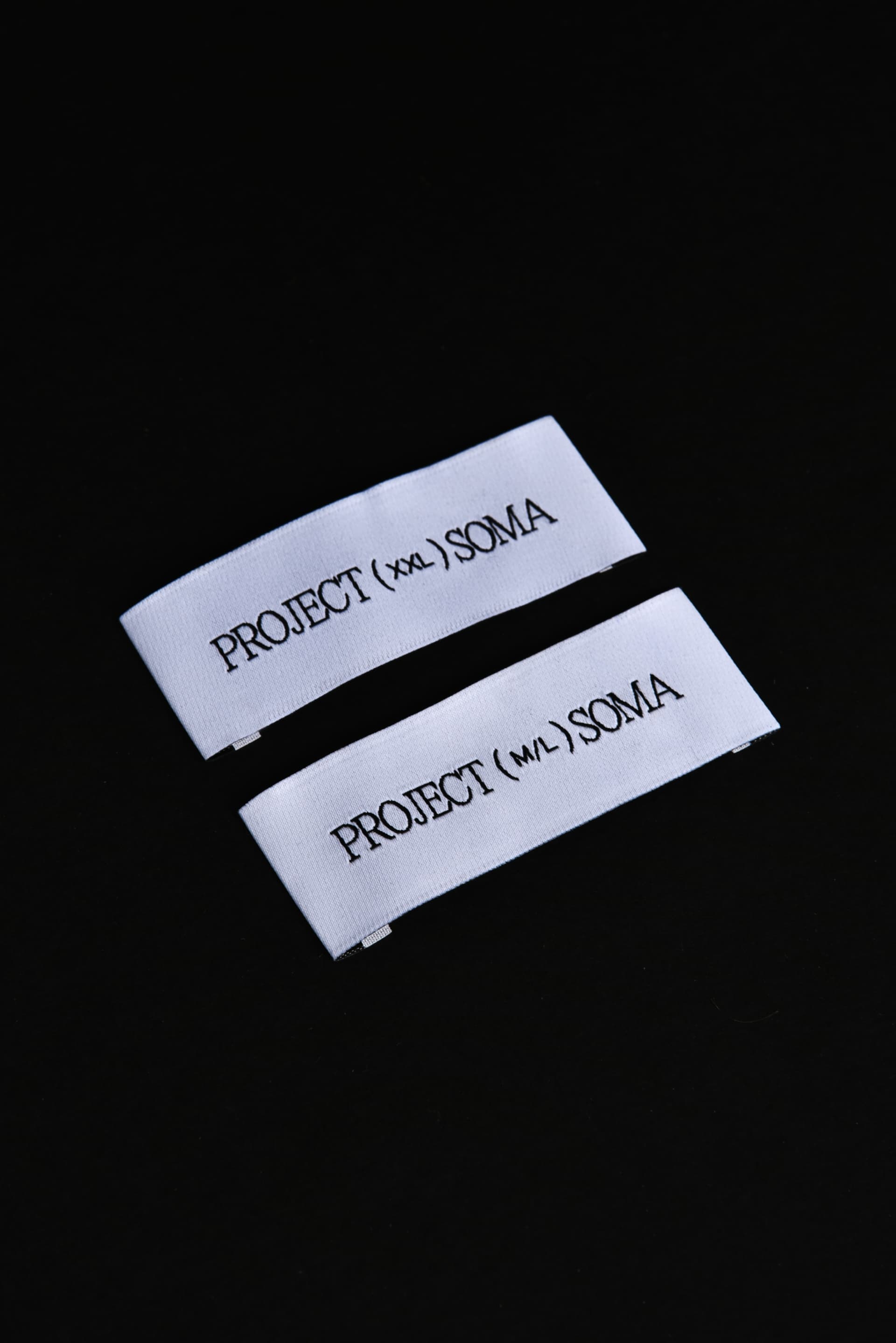
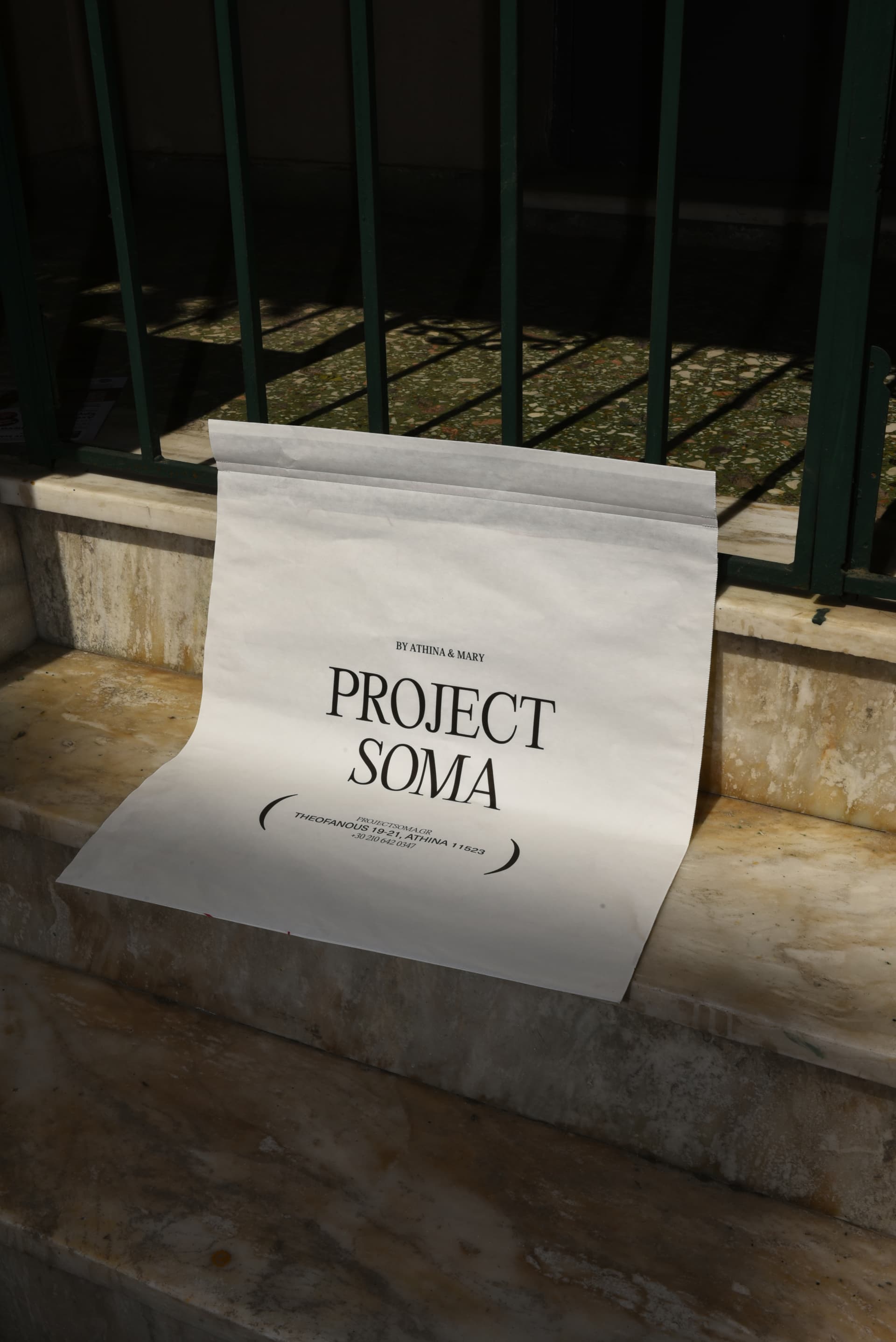
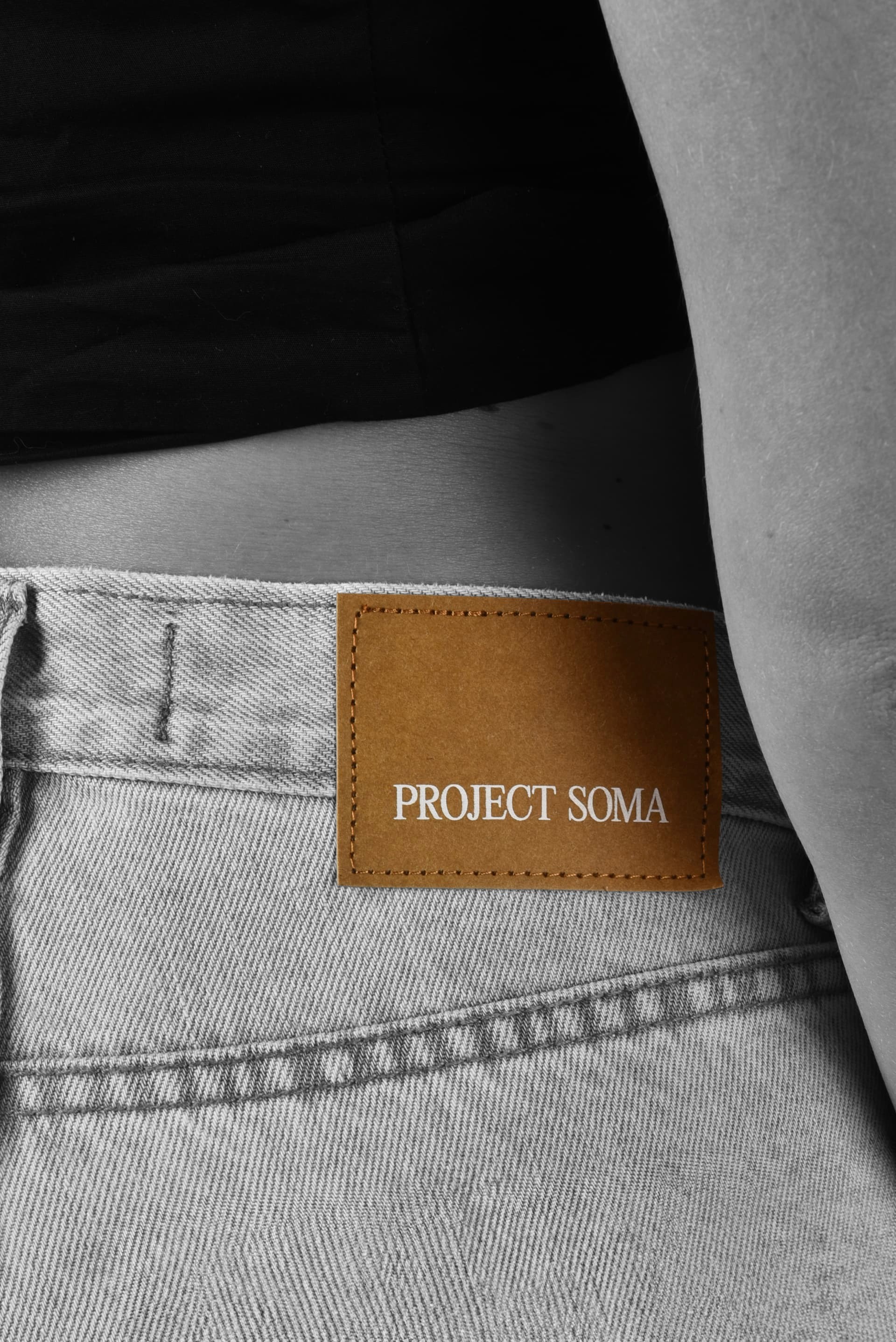
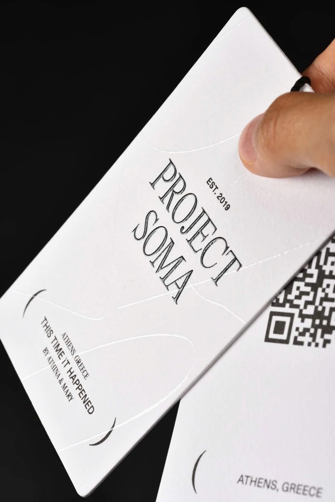
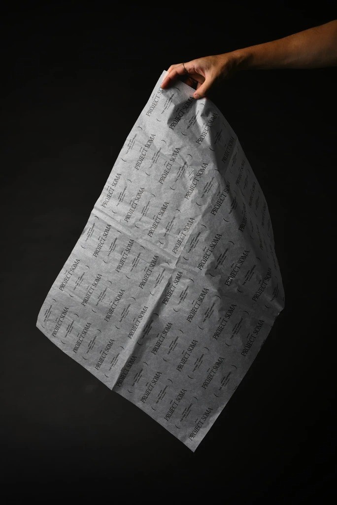
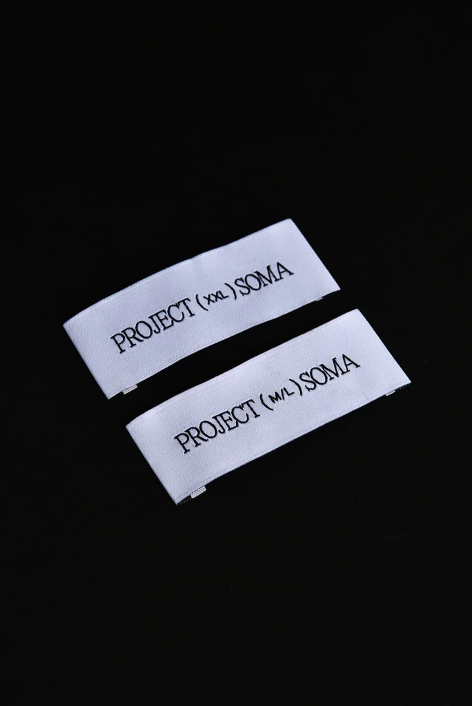
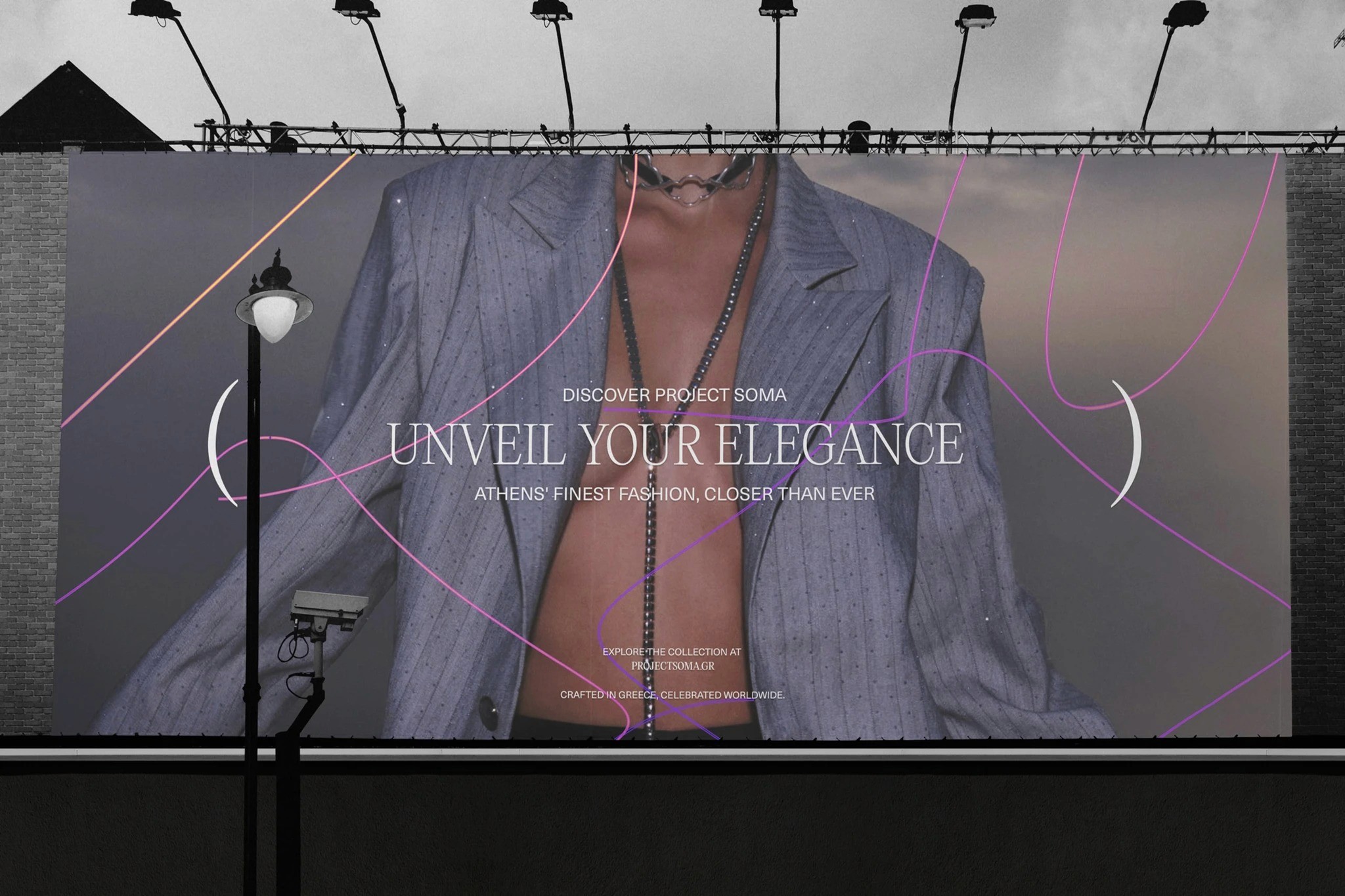
Project Soma’s new branding blends tradition with modernity, encapsulated in the thoughtful fusion of the Editorial New and Flora & Fauna typefaces. Editorial New imparts a classic sophistication, grounding the brand in timeless elegance, while Flora & Fauna adds a contemporary twist, symbolizing innovation and individuality. This combination reflects the dual essence of brand’s founders, Athina Oikonomakou & Mary Sinatsaki, marrying classical charm with forward-thinking creativity. The design's masterstroke, the parentheses enclosing: 'This time it happened,' goes beyond punctuation.
It symbolizes inclusion and the serendipitous journey of the brand from a fleeting idea to a fashion reality. The parentheses narrate the brand's story of spontaneity, diversity, and evolution. This rebranding isn't just a visual makeover; it's a narrative metamorphosis that invites engagement and embodies the spirit of Project Soma – spontaneous, inclusive, and continually evolving. It's a testament to fashion's power to weave diverse threads into a cohesive and compelling story. This project was done in collaboration with Vestart.
Client
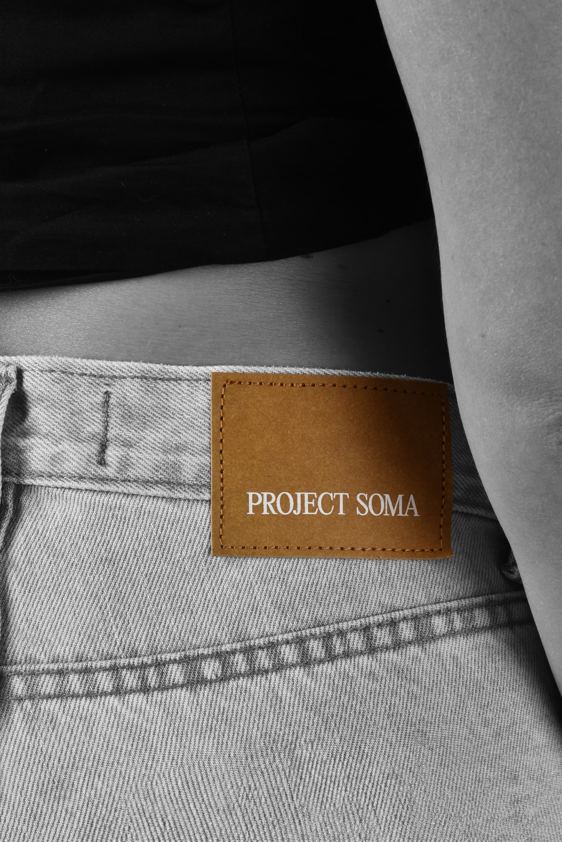
Project Soma
Category
Branding
Year
2024


More projects